CSS Dark Mode
Updated 2020-01-11
With the rise in popularity in dark mode across operating systems like iOS, macOS, Windows, etc., it is important to also update webpages dynamically depending on the user. Dark mode helps ease on the eyes when the documents are being viewed in dimly lit environment or at night, a common situation for most people. While there are browser extensions that attempts to inject custom CSS as a work around, it’s a lot better if the website natively supports dark mode.
I recently updated my website to be fully dark-mode compatible. You may or may not have noticed this change. The point is to make dark/light mode seamless and integrated with the system settings without any extra UI elements like a button the user can toggle on/off.
Media Query
At the time of writing, most modern up-to-date browsers support a new media query called prefers-color-scheme which is a way to see whether or not dark mode has been enabled system-wide. According to CanIUse.com, 77\% of the users globally have the browser support for this CSS media query.
Implementation is Easier Than You Think
The gist of dark mode is we want a different color scheme for the text and other UI elements, so we assign custom CSS within the prefers-color-scheme media query like so:
@media (prefers-color-scheme: dark) {
    /* dark mode colors */
    div.example { color: white; }
}
That’s it. However, just by adding these CSS rules for each of the elements can become messy very quickly.
Organizing Colors
Personally, I find it best when using CSS variables for assigning colors or styles. This way, when we enable dark mode, we simply have to change the variable values instead of assigning new CSS and the styles will update automatically.
Step 1: In the main CSS file, add the :root selector to make CSS variables:
:root {
	--text-color: #000;
	--bg-color: transparent;
	--nav-bg-color: #f8f9fa;
	--link-color: #0050C9;
	--link-hover-color: #A92626;
}
Step 2: Update existing CSS to reference the defined variables.
body {
	color: var(--text-color);
	background-color: var(--bg-color);
}

li.nav-item.active a {
	border-bottom: 2px solid var(--text-color);
}

li.nav-item {
	color: var(--text-color);
}
Step 3: Add prefers-color-scheme media query to modify the variables only.
@media (prefers-color-scheme: dark) {
	:root {
		--bg-color: #000;
		--text-color: #eee;
		--nav-bg-color: #111;
		--link-color: rgb(74, 125, 201);
		--link-hover-color: rgb(199, 91, 91);
		--frosted-glass-brightness: 0.5;
	}
}
Step 4: Done. There is no step 4.
Testing
Testing is important to ensure that whatever color scheme we implemented provides excellent contrast and legibility to the user, regardless of dark or light mode. In modern browser developer windows, there should be a panel called “Accessibility”. Upon inspecting the text elements in the document, the panel provides information on if the text has enough contrast or not.
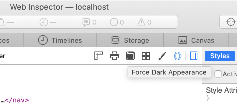
Also, in browsers such as Safari 13+, there is a toggle-able button to force dark mode of the web-page. This can be used for debugging purposes without actually changing the OS settings.